


Infographics matter
The people who most need to grasp the point of a report are often the least likely to read it in full. That's why infographics matter.
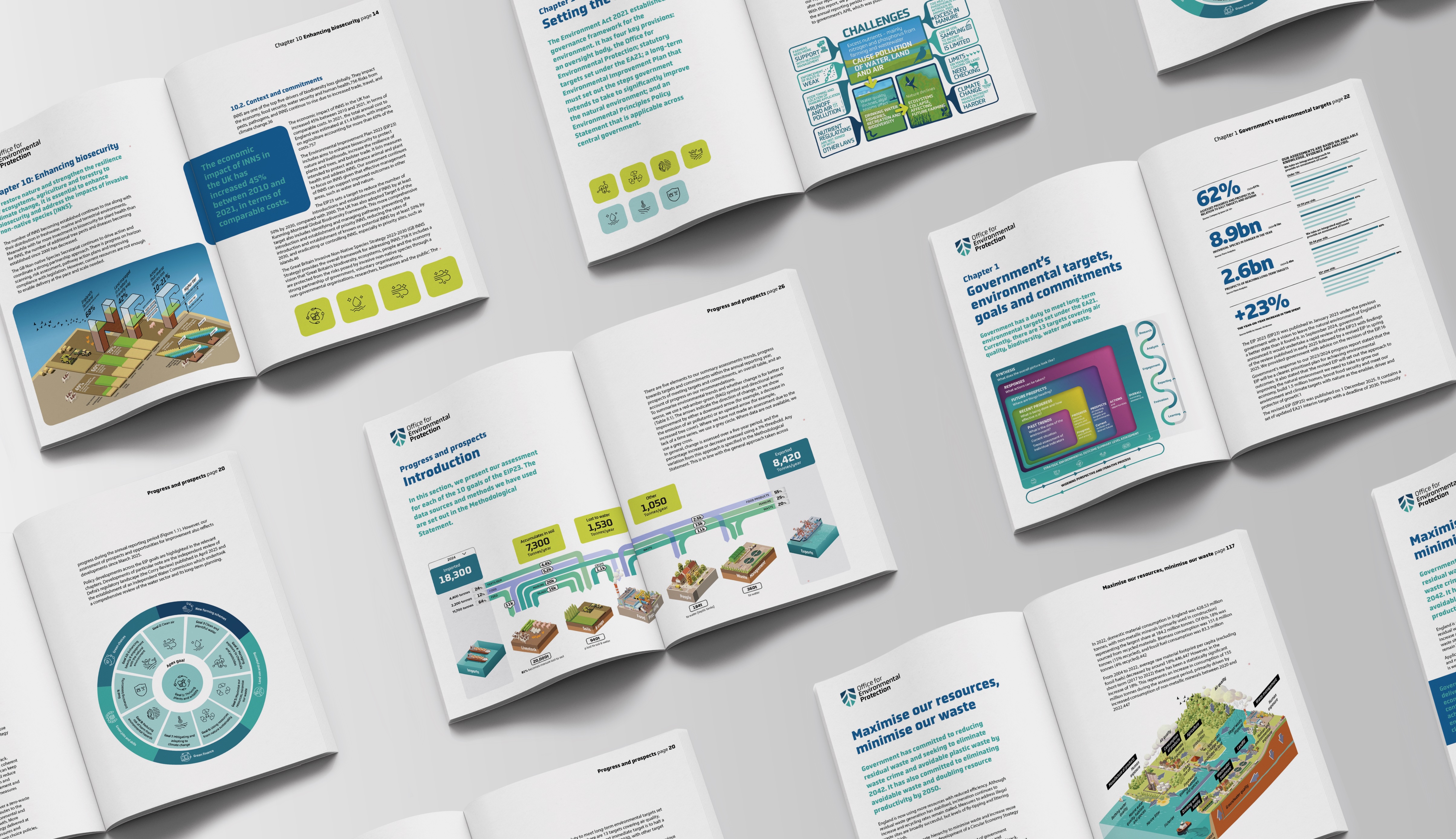
At their best, they can do in seconds what pages of text often cannot. They can take a complex scientific or policy issue and show not just what is happening, but why it matters. They can reveal scale, consequence and urgency at a glance.
A good infographic does more than simplify. It replaces density with clarity. It draws people in. It makes the subject interesting enough to stop for, clear enough to follow, and strong enough to remember. For ministers, senior officials and scrutiny audiences, that matters. They need to see the problem quickly, understand its implications, and know what may need to happen next.
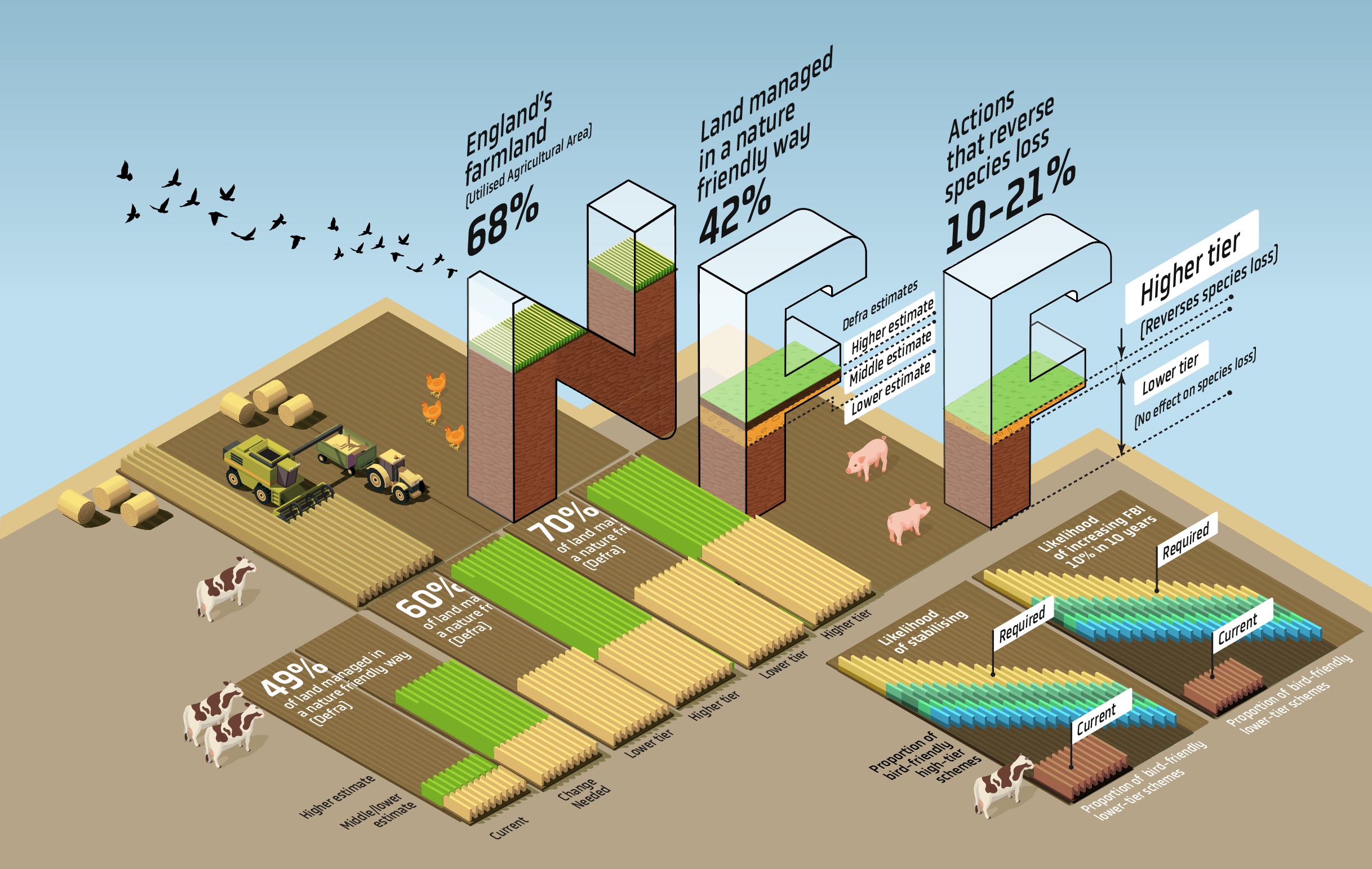
That is also what makes these assets so useful beyond the report itself. A strong infographic can travel. It can hold attention on social channels. It can work in presentations, parliamentary briefings and stakeholder meetings. It can speak to people who may not engage with the full publication, without losing the seriousness of the evidence behind it.
We've been making things interesting for the Office for Environmental Protection, HS2, the Natural History Museum, the Office for National Statistics, and the Science Museum for 15 years.
Need your evidence to travel?
We are easily procurable via the Communications Marketplace DPS (RM6124).